Have you gone to your local art store just to dream and touch all of the painting supplies?! Yass, see! I knew I couldn’t be the only one.
Have you also felt in over your head when it came time to actually buy some acrylic paint? Heavy-bodied, Acrylic Ink, Craft Acrylic – what does it all mean?! Don’t worry, I’m here to break it down, so you can confidently purchase some supplies and get started unleashing your inner creativity.
When you’re walking the aisles of your local art and craft store it feels like there are SO MANY options when it comes to choosing acrylic paint – between the brand and the type it can be too much. I’m going to talk about the different types of acrylic – heavy-bodied, soft-bodied, fluid & inks, and craft. Let’s break it down…
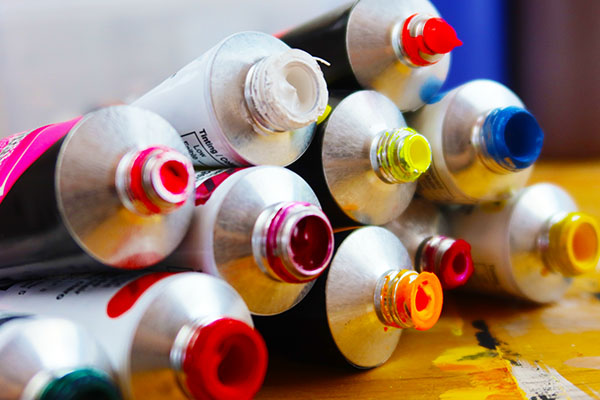
Heavy-bodied acrylic
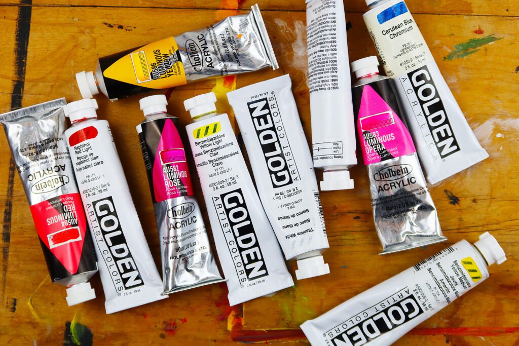
Heavy-bodied acrylics are thick and buttery and will resemble oil paint (which is thick and buttery). The colors will be lightfast and water-resistant when dry. These paints are the ones Professional artists typically use. (A few brands that make heavy-bodied acrylics are: Golden, Winsor & Newton, and Liquitex)
Heavy-bodied acrylics also come in student-grade paint. The student-grade version will offer a more affordable price point, but the paint won’t be as highly pigmented as the professional grade. There will also be less paint coverage with the student grade – meaning you won’t be able to paint one color on top of another and have it completely cover what was underneath as easily as you would be able to with its professional counterpart. Student-grade acrylics are an excellent choice for any beginner! (Examples of these are: Liquitex Basics, Blick Studio Acrylics, and Grumbacher Academy Acrylics)
Soft-bodied acrylic
Fluid acrylic and acrylic ink
Fluid acrylics will be more like watercolors. Artists will use these to create more drip-like paintings. The difference is that watercolor will be soluble when it’s wet again. And the fluid acrylic is plastic, so it ain’t movin’ once it’s dry.
Acrylic inks are fluid and similar to watercolors. You can use these to create gorgeous transparent layers.
Craft acrylic
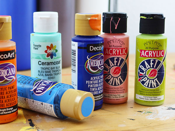
Craft acrylic comes in SO many incredible premixed colors!! And, they have the best names – Passionate Purple, Caribbean Breeze, and Key Lime Pie! You can absolutely put these paints on a canvas and crank out some beautiful creations. They are a little waterier than heavy-bodied acrylics, so they won’t be quite as opaque and thick, but you can still absolutely use these on a canvas to create some wonderful scenes.
- One thing to note, due to the binder (acrylic polymer) that is usually used, it’s white when wet, but dries clear. As a result, the paint darkens when it dries. So just a head up, often the student grade or craft paint will have a greater color shift. There’s nothing wrong with that, it’s just important to know.


Leave a Reply